
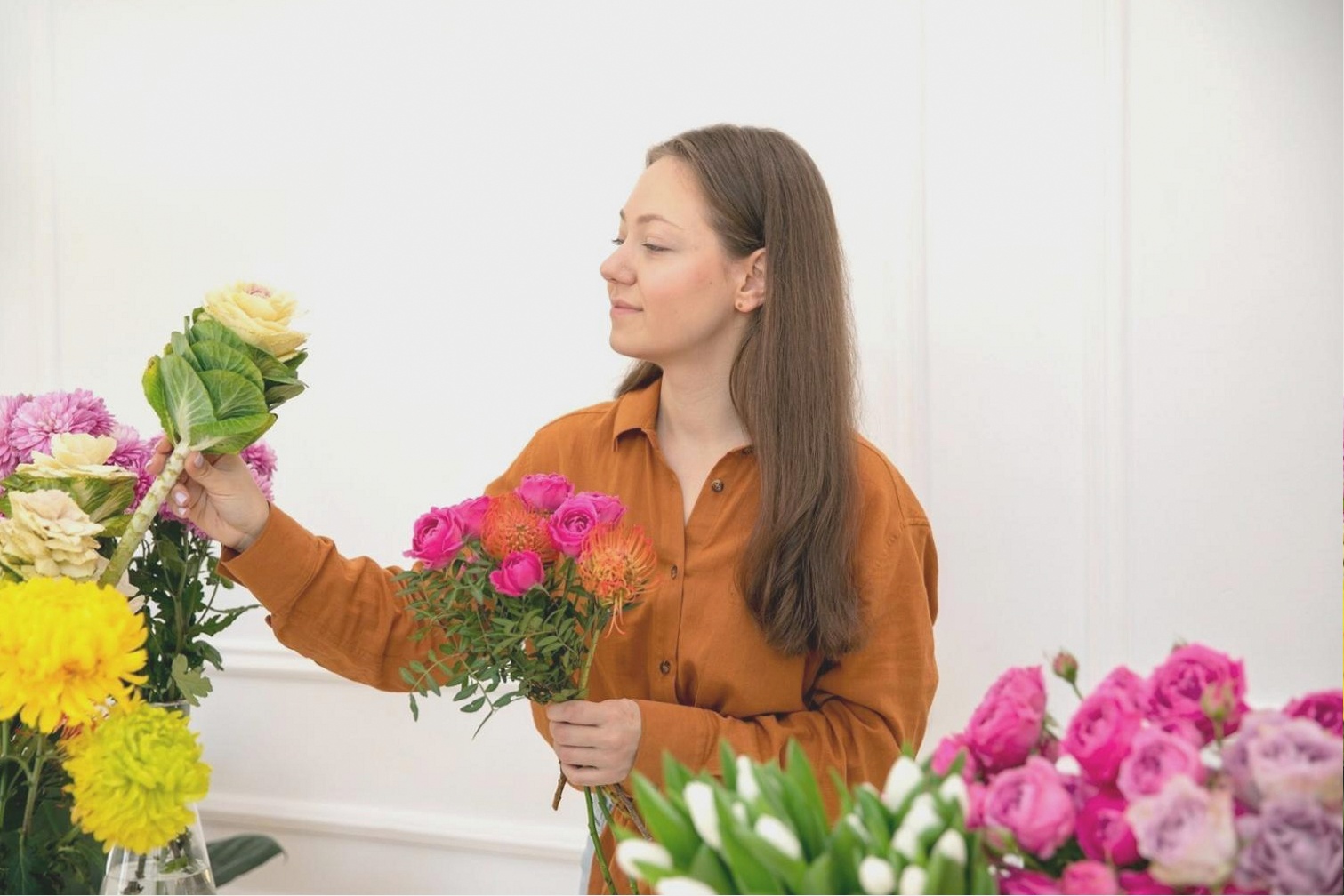
The bride wore a gown with a blue-ivory undertone. I delivered a bouquet built around warm peach and terracotta tones. In every photograph, the bouquet looked like it belonged to a different wedding. No one caught it during planning because no one held a physical fabric swatch next to the flowers.
The specific failure point
Colour matching from a screen is unreliable. Monitor calibration varies, lighting conditions in photos differ from real environments, and warm versus cool undertones in white and ivory fabrics are nearly invisible on a JPEG but obvious in person.
Quick tips for preventing palette clashes
- Request a physical fabric swatch from the bridal boutique at least 6 weeks before the event
- Hold your proposed flowers next to the swatch under natural daylight, not artificial light
- Identify whether the gown reads warm, cool, or neutral before selecting any bloom colour
- For warm ivory gowns, soft blush, champagne, and warm white flowers work reliably
- For cool ivory gowns, pure white, soft lavender, and dusty blue complement without competing
This kind of analytical pre-check suits introverts well. It is a solo task, requires no social negotiation, and produces a clear binary answer before any money is spent on flowers.
The fix took 1 fabric swatch and 15 minutes of comparison. The original mistake took months to stop thinking about.